Hi, We’re introducing our new brand identity, created to reflect who we are today. Here is a brief overview of why we’ve rebranded and the changes you will see day to day.
Why we updated
- Our previous look no longer matched our scale and expertise.
- A modern presence helps attract great people and serve a broader client base.
Our Why, How and What (updated)
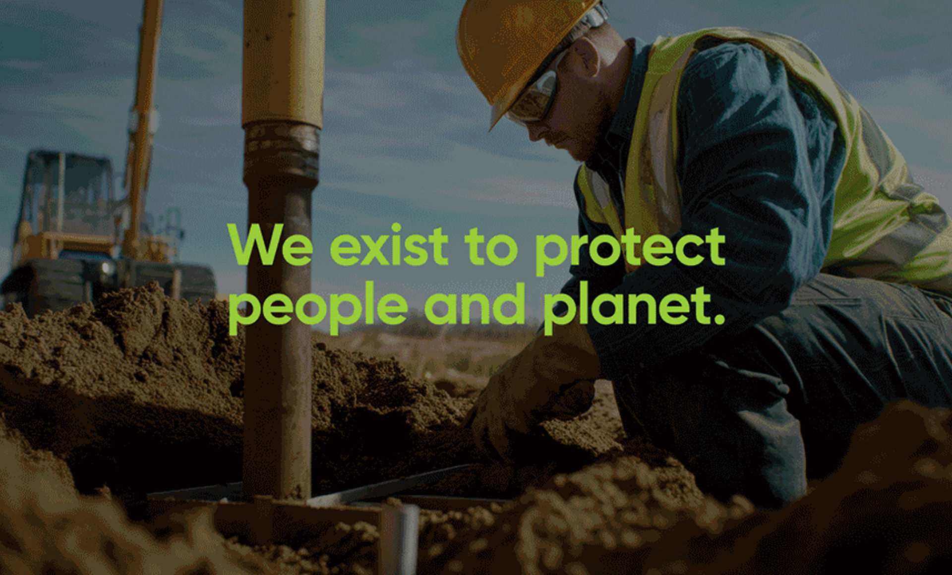
- Why (Purpose): We exist to protect people and planet.
- How (Approach): By pairing local experts with ISO-certified quality in the field, then translating findings into plain-English, actionable advice that clients can trust.
- What (Services): From site investigation to design and compliance, we turn ground data into reliable engineering solutions that keep projects moving first time.
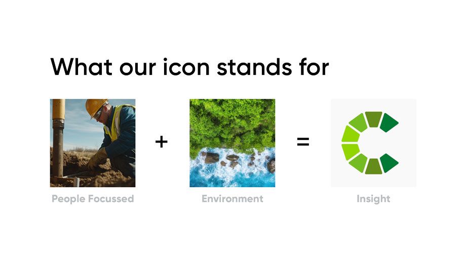
What our icon stands for:
People Focussed + Environment = Core.
Ten green segments form a foundation-inspired “C” that symbolises collaboration and measured insight. The green spectrum signals growth and environmental awareness; precise geometry reflects engineering rigour; the open form conveys clarity and trust.
Why clients choose us
- 10+ years of robust data and processes
- ISO 9001 and 14001 certified
- 40+ specialists, 5,000+ projects delivered, 3 offices state-wide
- 90% repeat-client rate
Thank you for your continued support.
If you’d like to discuss an upcoming project, we’re here to help.